
Selling the Journey Before the Ticket
Commercial airline tourism begins long before a boarding pass is scanned or a cabin door sighs shut. It starts in the imagination. Airlines do not merely sell seats or schedules. They sell anticipation, belonging, escape, prestige, warmth, efficiency, adventure. Their most powerful tool in doing so is visual language.
Every airline operates within the same physical constraints. Aluminium tubes, wings, runways, weather, regulations. Yet visually, they occupy radically different emotional territories. One carrier promises barefoot island ease. Another suggests precision, discipline and global competence. A third trades in nostalgia, romance or national pride. These messages are not delivered through words alone. They are painted, stitched, photographed, filmed and choreographed across every touchpoint a traveller encounters.
In the crowded skies of commercial aviation, visual branding is not decoration. It is strategy. It shapes how destinations are perceived, how journeys are remembered, and how airlines differentiate themselves in a market where price and route networks are often comparable. Livery, uniforms and marketing imagery become shorthand for the experience to come. They are the airline’s accent, posture and body language.
This article explores how airlines use visual branding to sell destinations, not just flights. From the psychology of aircraft liveries to the semiotics of cabin crew uniforms and the cinematic storytelling of modern airline marketing, we examine how visual language has become central to commercial airline tourism.
The Aircraft as Billboard: Livery and Identity
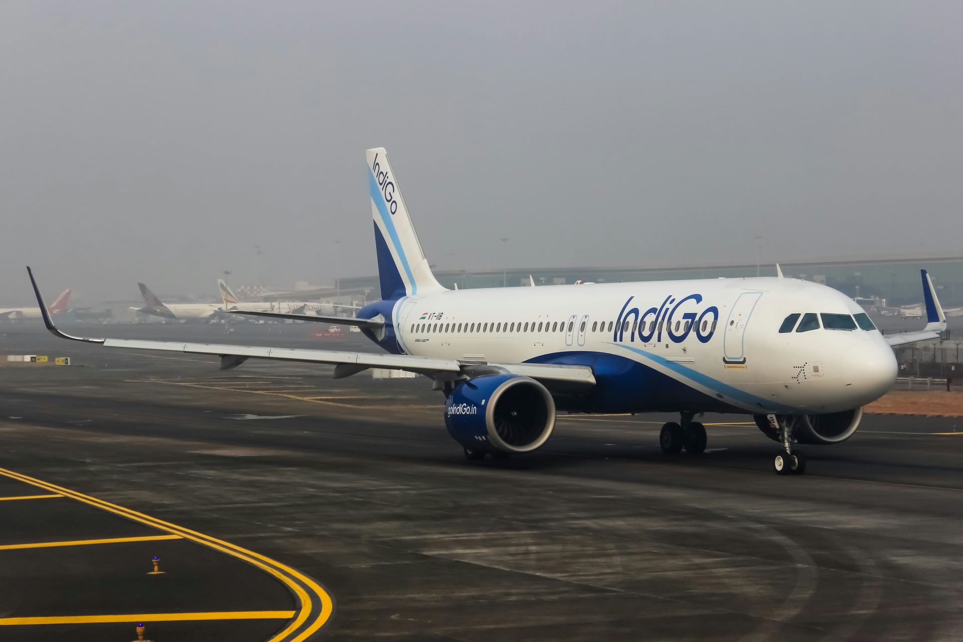
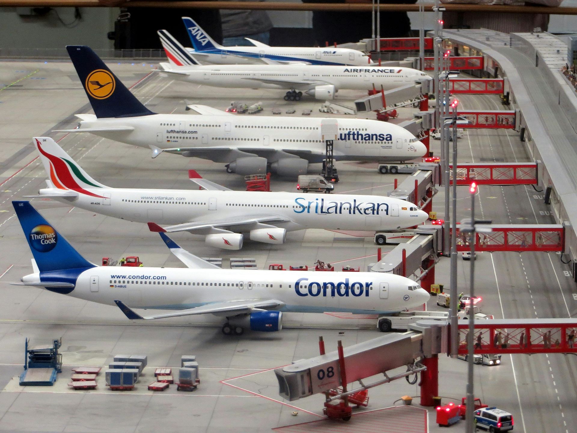
An aircraft livery is one of the most visible brand assets in the world. It moves through cities, crosses borders and sits photographed against iconic skylines. For many travellers, the first physical encounter with an airline is not a website or a cabin, but the sight of a tail fin through an airport window.
Livery design balances engineering constraints with emotional expression. It must work on a massive scale, be legible at speed, comply with safety requirements and age gracefully under sun, ice and jet fuel. Yet within those limits, it carries enormous symbolic weight.
National carriers often use livery as a visual declaration of origin. Colours, symbols and typography subtly encode the airline’s homeland. This is particularly powerful in tourism-driven aviation, where the airline acts as both transport provider and cultural ambassador. The aircraft becomes a flying postcard, introducing passengers to a destination’s character before arrival.
Conversely, some airlines deliberately detach from national symbolism. Global carriers targeting business and premium leisure travellers may opt for restrained palettes and minimalist design. This visual neutrality suggests universality and professionalism, positioning the airline as a connector of worlds rather than a representative of one.
Low-cost carriers take a different approach. Bright colours, oversized typography and playful graphics signal accessibility and energy. These liveries do not whisper prestige. They shout availability. For tourism markets built on volume and affordability, this visual clarity supports the promise of easy travel.
What matters most is consistency. A livery must align with the airline’s broader brand narrative. A luxurious cabin experience feels discordant if wrapped in a visually aggressive exterior. Likewise, a relaxed holiday-focused airline risks confusion if its aircraft looks corporate and austere. In tourism aviation, livery sets the emotional temperature of the journey.
Colour Psychology at 35,000 Feet
Colour is one of the most immediate conveyors of meaning in airline branding. Before a logo is recognised or a slogan remembered, colour communicates mood.
Warm palettes are often associated with leisure, hospitality and exotic destinations. Earth tones, blues and sunset hues evoke beaches, deserts and open skies. Airlines serving holiday routes lean into these associations, using colour to trigger escapism.
Cool palettes, particularly blues, greys and whites, dominate legacy and long-haul carriers. These colours suggest trust, reliability and calm. In the context of air travel, where safety and reassurance are paramount, cool tones reduce anxiety and reinforce competence.
Red is used sparingly and strategically. It conveys energy, passion and national pride but can also suggest urgency or aggression if overused. When balanced carefully, it becomes a powerful accent that commands attention without overwhelming.
Black and metallic finishes, increasingly popular in premium branding, signal sophistication and exclusivity. They transform aircraft into luxury objects, aligning the airline with high-end hospitality and aspirational travel.
The success of airline colour strategy lies in restraint. The most enduring liveries avoid trend-chasing. They aim for timelessness, knowing that an aircraft may wear the same visual identity for decades. In tourism branding, longevity reinforces trust. A familiar colour scheme becomes part of the travel landscape, as recognisable as a skyline or landmark.
Uniforms as Moving Brand Architecture
If the aircraft is the billboard, cabin crew uniforms are the human interface of airline branding. They move, speak, gesture and smile. Uniforms translate abstract brand values into lived experience.
Historically, airline uniforms borrowed heavily from military and naval traditions. Structured silhouettes, caps and insignia communicated authority and safety. This visual language reassured early passengers and established aviation as a disciplined, reliable industry.
As commercial airline tourism expanded, uniforms softened. Fabrics became lighter, colours warmer, designs more expressive. Airlines began using uniforms to signal hospitality rather than hierarchy. The cabin crew became hosts rather than officers.
Today, uniforms serve multiple functions simultaneously. They must be practical, culturally sensitive, inclusive and visually distinctive. They also carry immense symbolic weight. A well-designed uniform can evoke national dress, contemporary fashion or understated luxury without tipping into costume.
Tourism-focused airlines often incorporate subtle cultural references into uniform design. Patterns, textures or accessories nod to traditional attire, offering passengers a visual introduction to the destination. This approach works best when executed with authenticity and restraint. Overly literal interpretations risk feeling performative rather than welcoming.
Premium carriers invest heavily in uniform design as part of the luxury narrative. Collaborations with fashion designers elevate uniforms into couture-adjacent statements. Clean lines, tailored fits and premium materials reinforce the airline’s positioning alongside five-star hotels and fine dining.
Low-cost carriers, by contrast, prioritise approachability. Their uniforms often use bright colours and relaxed cuts, reducing perceived distance between crew and passengers. This visual informality aligns with the democratic promise of affordable travel.
Uniforms also play a crucial role in marketing imagery. They anchor brand recognition across advertising, social media and in-flight content. A distinctive uniform becomes shorthand for the airline experience, instantly recognisable even when the aircraft itself is not visible.
Visual Consistency in the Airport Ecosystem
Airline branding does not exist in isolation. Airports are complex visual environments, filled with competing signals. Within this noise, airlines must maintain coherence.
Check-in counters, signage, lounges and boarding gates extend the airline’s visual language into shared spaces. Consistent typography, colour use and material choices create a sense of continuity. For travellers, this consistency reduces friction. It reassures them they are in the right place, with the right airline, heading toward the promised experience.
Lounges are particularly important in tourism branding for premium and long-haul travellers. They act as transitional spaces between everyday life and the journey ahead. Visually, lounges often reflect the airline’s interpretation of home culture or destination aesthetics. Natural materials, lighting and artwork subtly prepare passengers for what lies ahead.
For leisure-focused airlines, visual cues within the airport can amplify excitement. Open layouts, vibrant imagery and destination photography turn functional spaces into emotional primers. The journey feels like it has already begun.
Consistency does not mean rigidity. Successful airline brands adapt their visual language to local contexts while maintaining core identity. This balance allows global recognition without cultural insensitivity, an essential consideration in international tourism.
Marketing Imagery and the Art of Promise
If livery and uniforms establish identity, marketing imagery tells the story. Airline advertising rarely focuses on aircraft performance alone. Instead, it frames the airline as the gateway to experiences.
Modern airline marketing is cinematic. Wide shots of landscapes, intimate moments of connection, carefully styled cabin scenes. The aircraft itself often appears as a facilitator rather than the hero. The destination takes centre stage, with the airline positioned as the elegant conduit.
Visual storytelling in airline marketing relies heavily on aspiration. Campaigns do not depict average trips. They depict idealised journeys. Sunlit arrivals, serene cabins, effortless transitions. This is not deception but invitation. Tourism marketing trades in possibility, not probability.
The most effective campaigns align visual tone with brand promise. An airline positioning itself as adventurous will showcase rugged landscapes and spontaneous moments. A luxury-focused carrier will emphasise calm, space and refinement. A family-oriented airline will highlight warmth, inclusivity and shared joy.
Representation matters increasingly in airline marketing. Diverse travellers, ages and cultures reflect the global nature of tourism. Visually inclusive campaigns broaden appeal and signal openness.
Digital platforms have expanded the canvas. Social media allows airlines to experiment with more immediate, less polished visuals. Behind-the-scenes content, crew stories and destination snapshots humanise the brand. Yet even here, visual coherence remains vital. Filters, colour grading and composition subtly reinforce identity.
Selling Destinations Without Saying Their Names
One of the most sophisticated uses of visual branding in airline tourism is suggestion. Great campaigns often imply destinations rather than announce them.
A particular quality of light, a texture, a rhythm of movement. These cues allow viewers to recognise places emotionally before intellectually. The airline becomes associated not just with locations, but with feelings those locations evoke.
This approach is especially powerful for airlines serving multiple destinations. Rather than promoting routes individually, they promote a philosophy of travel. The brand becomes a promise of how the world will feel through their lens.
Visual minimalism plays a role here. By stripping away clutter, airlines allow the destination’s essence to shine. A single horizon line, a gesture, a colour field. The restraint signals confidence and sophistication.
In tourism markets saturated with imagery, subtlety stands out. It invites viewers to lean in, to project their own desires onto the scene. The airline becomes a collaborator in imagination rather than a loud salesperson.
Evolution Without Erasure: Rebranding in Aviation
Airline rebrands are among the most complex in the commercial world. They involve physical assets worth billions, global recognition and deep emotional attachment from customers.
When airlines refresh their visual identity, the challenge is evolution rather than reinvention. Tourists value familiarity. Sudden, radical changes can disrupt trust. Successful rebrands respect heritage while refining expression.
Often, changes focus on simplification. Cleaner lines, updated typography, refined colour palettes. These adjustments modernise the brand without alienating loyal passengers.
Uniform updates follow similar principles. Small shifts in cut or material can modernise appearance while preserving recognisable elements. The goal is continuity across generations of travellers.
Marketing visuals typically lead rebrands, introducing new tone and perspective before physical assets change. This phased approach allows audiences to acclimate emotionally.
In tourism-driven airlines, rebranding is rarely about correction. It is about relevance. As travel motivations evolve, visual language must adapt to new values, sustainability concerns and cultural expectations.
Sustainability as a Visual Narrative
Environmental responsibility has become a central issue in commercial aviation. Visual branding plays a delicate role in communicating sustainability without greenwashing.
Airlines increasingly incorporate natural imagery, softer palettes and organic materials into branding. While these cues signal environmental awareness, they must be supported by genuine action. Savvy travellers can sense dissonance.
Some airlines visualise sustainability through transparency rather than symbolism. Behind-the-scenes imagery, honest depictions of operations and educational content build credibility.
Uniforms and interiors using recycled materials offer tangible proof points. When these elements are visually appealing, they reinforce the idea that sustainability and quality can coexist.
In tourism branding, sustainability visuals often emphasise preservation. The airline positions itself as a guardian of destinations rather than a consumer of them. This narrative resonates strongly with modern travellers who seek ethical experiences.
The Emotional Afterimage of Travel
The success of airline visual branding is ultimately measured not at take-off, but in memory. What lingers after the journey ends.
Travellers may forget seat numbers and flight times, but they remember how the experience felt. Visual cues anchor those feelings. The colour of the cabin at dawn. The uniform that greeted them. The image that first inspired the booking.
Strong airline branding creates emotional afterimages. These memories influence future choices, recommendations and loyalty. In tourism, where journeys are episodic, memory is currency.
Airlines that understand this invest in cohesive, emotionally intelligent visual systems. They recognise that every visual decision contributes to the story passengers tell themselves about their travels.
The Sky as a Canvas
Commercial airline tourism operates in a competitive, regulated and emotionally charged space. Within it, visual language offers airlines a powerful means of differentiation and connection.
Livery transforms aircraft into ambassadors. Uniforms turn staff into storytellers. Marketing imagery opens windows onto imagined worlds. Together, these elements sell destinations before travellers ever leave the ground.
In an era of abundant choice, visual branding does not merely attract attention. It shapes perception, builds trust and fuels desire. The most successful airlines understand that they are not just moving people through space. They are guiding them through expectation, experience and memory.
The sky, it turns out, is not empty at all. It is crowded with stories, painted on wings, stitched into uniforms and projected onto the collective imagination of travellers everywhere.
Breyten Odendaal
Our travel editorial desk specializes in uncovering the best flight deals and destination insights within South Africa. We bring you first-hand updates on airline industry moves and budget travel hacks.
More From Travel News

Inside Airline Pilot Training for Modern Aircraft
Discover how airlines train pilots for modern aircraft using advanced simulators, strict certification pipelines and continuous recurrent training.

Why Airlines Overbook Flights Using Smart Forecasting
Airlines overbook flights using revenue models and no-show prediction systems to maximise seat occupancy and reduce losses in commercial aviation.

Aviation and Domestic Tourism: How Flights Change Travel
How short-haul flights reshape domestic tourism, shifting travellers from road trips to faster air mobility and changing travel behaviour.
Stay Informed, Stay
Ahead of the Curve
We don't just follow the headlines — we dive deeper. Our well-researched content is designed to empower you with the knowledge needed to navigate an industry shaped by innovation.
Seasoned Professionals
Industry stats and market performance metrics.
Passionate Enthusiasts
Vehicle launches and future transport concepts.